When Senate Majority Leader Mitch McConnell, a Kentucky Republican, expressed reluctance to fund coronavirus relief for hard-hit cities and states, suggesting they would be “blue state bailouts,” New York Gov. Andrew Cuomo had a quick retort.
“We put into that pot $116 billion more than we take out,” Cuomo said. “Kentucky takes out $148 billion more than they put in.… Senator McConnell, who’s getting bailed out here?”
The debate sparked a furor on social media and has generated a great deal of discussion about a report published by my team at Rockefeller Institute of Government, the public policy research arm of the State University of New York System. The annual report tracks federal revenue and spending in each of the states, showing which states send more to the federal government than they receive.
Balance of payments calculations like this have been a part of the federal spending policy discussion for over 40 years.
Over that time, the rankings have changed little, except during times of crisis when a state’s economy takes a hit or federal aid pours into the region. A few states, primarily in the Northeast, have long received less than they paid in.
To understand why, it’s important to understand where the funding that flows into the federal government comes from and how it flows back out to the states.
Money in, money out
The majority of the money flowing into federal coffers comes from taxes paid by state residents and businesses.
About 90% of federal revenue comes from individuals’ income taxes and payroll taxes for social security, Medicare and unemployment insurance. Corporate income taxes and excise taxes represent the rest.
When money flows back out of the federal government as federal spending, it’s through four channels: The first and largest is direct payments to individuals through programs such as Social Security and Medicare. The second largest are grants to state and local governments to fund programs such as Medicaid, highway spending, education, and other social safety net programs. The final two are contracts and federal wages, which are distributed more heavily to areas where the federal government is a major employer.
The difference is known as the balance of payments.
A positive balance of payments means the state’s residents, businesses and municipalities receive more in federal government spending than they pay in taxes. Our report refers to these states as the “getters.”
On the other end are “giver” states whose residents and businesses pay more in taxes than the state receives in federal spending.
A crisis can shift the balance
Sen. Daniel Patrick Moynihan, a New York Democrat, introduced the balance of payments calculation in 1977 to demonstrate that his state was being shortchanged in federal spending.
Two years earlier, President Gerald Ford had threatened to reject federal funding to help New York City stem a financial crisis, inspiring the famous newspaper headline: “Ford to City: Drop Dead.” He later signed legislation approving federal loans, which the city paid back with interest.
Moynihan’s annual reports, called “The Fisc,” tracked the impact of federal spending and tax collection on the states.
The lineup is driven by demographics. States with a larger share of higher-income residents will consistently pay more in income taxes. States with older populations will receive more through social security and medicare. A state’s position can also shift during times of crisis, such as after a hurricane, when federal assistance flows into the region.
Why are a few states such big givers?
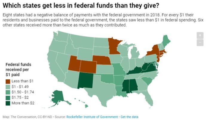
The biggest givers in our latest report, based on 2018 data, were New York, which paid in US$22 billion more than it received; New Jersey, which paid $12 billion more; Massachusetts, which paid $9 billion more; and Connecticut, which paid $8 billion more than it received.
Combined, these states paid over $50 billion more in taxes than they received in federal spending. For each dollar workers and businesses paid in taxes, the states got an average of 90 cents back. (When Cuomo cited the differences between New York and Kentucky, he was looking at four years of data.)
That negative balance of payments in the Northeast is driven by the large concentration of high-income residents.
The U.S. has a progressive income tax structure, and individuals in these state have a higher income-tax burden. As a result, the revenue side of the states’ balance of payments calculation is higher than the spending side.
Why do some states get more?
The getters can be broken down into two categories: those with both high incomes and high levels of federal spending, and those with low incomes and high federal spending.
Virginia and Maryland are two high-income states with higher than average per capita tax burdens, but they also receive high levels of federal funding because they are adjacent to Washington, D.C. and benefit from contract spending and federal worker wages.
The low-income states that receive a lot of federal spending per person are primarily in the Southeast and include Kentucky, West Virginia, Mississippi and Alabama.
With lower-than-average income levels, residents in these states contribute less through income taxes. They also receive higher-than-average levels of spending from programs such as Social Security, Medicare, social assistance grants and contracts.
Why does it matter?
A state’s financial relationship with the federal government can have profound long-term policy implications for the state, its residents and businesses.
That’s especially true now as the coronavirus crisis sends costs soaring for local and state governments, while slashing their income and sales tax revenues. It isn’t just in New York, Illinois and the other Democratic-leaning states with large urban centers – the virus is creating financial stress on state and local governments across the country.
Understanding the balance of payments data will help inform policymakers as they renegotiate these state-federal financial relationships through federal assistance in response to the COVID-19 public health crisis and subsequent economic recovery.
This article has been updated to align the paragraph with state data to 2018 balance of payment numbers.


