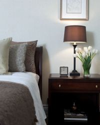
 “There are no textbook rules for you to follow; trust your gut and your eye. See more home design pictures.Lucidio Studio Inc/Photographer’s Choice RF/Getty Images
With channels of home decorating shows a remote click away and a bundle of design magazines on the shelves, DIY decorating has become all the rage. And, as a result, many homeowners are using creativity and instinct in lieu of formal training to decorate their lairs. Some of the traditional rules still apply, but here are 10 design myths that you don’t need to worry about.
Contents
- The Ceiling Has to Be White
- White Rooms Look Bigger
- Everything Has to Match
- Big Furniture Makes a Room Seem Smaller
- Sofas Always Go Against a Wall
- There's No Such Thing as Over-accessorizing
- Always Include the Trends
- You Should Either Go High-end or Cheap
- You Can Decide on the Design as you Go
- There are Rules to Decorating
10: The Ceiling Has to Be White
We all know that white is the typical color for a ceiling, but there’s no decorating rule that says it has to be. Painting the ceiling two shades lighter than the wall color can help smaller rooms feel more airy and spacious. But if the room is already cavernous and you want to give it more of a cozy feel, choose a darker color to give the illusion of bringing the ceiling down.
Did You Know?
White is a popular ceiling color because it reflects light evenly, which helps a room seem more spacious.
9: White Rooms Look Bigger
 “A white room doesn’t equal bigger, but it can equal boring.Andrew Bret Wallis/Photographer’s Choice/Getty Images
White rooms are popular for a couple of reasons. They complement a modern, minimalist aesthetic, and they don’t compete with other bold design choices. Clean is the buzzword most people use when opting for white, but it’s a myth that white walls make a room look larger. Color creates depth and interest, and our eyes tend to move from darker colors to lighter colors. This is what allows us to judge the distance between two walls and what creates the illusion of space — or the lack thereof.
8: Everything Has to Match
Everything in a room does not have to match, but you do want pieces to coordinate for a cohesive look. An elegant Louis XVI chair isn’t a good complement to the clean lines of a mod Parson’s table, but this doesn’t mean that your entire living room has to be decorated with Victorian antiques. If you’re mixing styles, it’s important to choose pieces that visually balance each other. For example, a roomy sectional with big, deep cushions is best paired with a chunky coffee table, while a smaller scale couch with tailored cushions will coordinate better with a spindly, mid-century modern coffee table.
Did You Know?
Something is typically considered an antique if it’s more than 100 years old. But that’s not to say that everything old is actually an antique. "Antique" also implies good craftsmanship and high value.
7: Big Furniture Makes a Room Seem Smaller
 “Let one piece of furniture stand out from the rest.Kevork Djansezian/Staff/Getty Images Entertainment
Furniture is all about scale, and the trick to proper furniture placement is to make sure you have the right pieces in the right proportions in the right places. Small furniture tends to get lost in large rooms, so to make an overly large living room feel like a cozy lair, you’ll need furniture that matches in girth. Conversely, a small living room may accommodate a good-sized couch, but all other furnishings should be scaled down so the room doesn’t seem overstuffed. Choose furniture combinations that leave plenty of space for traffic to move comfortably and that add the illusion of space by keeping the floor visible.
6: Sofas Always Go Against a Wall
Sofas are typically the largest piece of furniture in your living room or den, which inherently makes them the focal point. If your hang-out area is on the small side, the wall may be the only place that your sofa actually fits. But if you have some extra space to play with, there are other options that will create more visual interest. Putting your sofa on a diagonal makes your room seem a little larger, plus it gives you extra storage in the corner behind it. You can also pull your sofa out from the wall to allow traffic to move behind it. Just be sure to leave a walkway of about 3 feet.
Did You Know?
Davenport, couch, settee and divan are all acceptable substitutes for the word sofa.
5: There's No Such Thing as Over-accessorizing
 “You don’t have to go all-out minimal, but know when to edit.Jean-Yves Bruel/Photographer’s Choice/Getty Images
You want your home to make a statement about you, but that doesn’t mean putting everything you love on display all at once. Accessories create focal points in a room, so they should be chosen and placed carefully to draw the eye to something interesting. Including too many in one space clutters up the room. If you have many pieces that you love, consider redecorating seasonally and rotating your favorites in and out.
4: Always Include the Trends
If you’re looking through a magazine for decorating ideas, you’re bound to become influenced by the current trends. There’s nothing wrong with this, but choosing what’s hot at the moment may not ultimately belie your true style. Plus, trends come and go, so decorating around them isn’t the best strategy if you want a look that lasts. If you must jump on the trend bandwagon, do it in small ways like pillows, rugs and curtains that can easily be changed out when it falls out of fashion favor.
Did You Know?
Shelter magazines are publications that focus on all things home-related.
3: You Should Either Go High-end or Cheap
 “Part of the fun of decorating is the hunt for pieces to mix and match.Tim Klein/Lifesize/Getty Images
Furnishing and decorating your home is a considerable expense. There’s no hard and fast rule that it either has to be all 19th century antiques or all assemble yourself Ikea. Usually a good mix of high-end and affordable yields pleasing results. Experts recommend saving your splurges for furniture that gets a lot of use, like your bed and couch. But there are lots of bargains on accessories like rugs and throw pillows that give you the flexibility to change them on a whim.
2: You Can Decide on the Design as you Go
Designing on the fly is likely to lead to a big mess. For a successful design plan, it’s important to start with a clear picture of what you want, and it’s even better to have it down on paper. You can successfully mix styles and pieces, but even if you’re a seasoned pro, this requires considerably more strategy than just picking up decor that you like on a whim.
Did You Know?
The term "fly by the seat of your pants" actually comes from the aviation industry. Early planes lacked the sophisticated instruments they have today, so pilots largely had to fly based on their judgment and instinct.
1: There are Rules to Decorating
 “Decorate a room you love and you want to spend time in.Jean-Yves Bruel/Photographer’s Choice/Getty Images
There are guidelines to a successful decorating scheme, but there are no hard and fast rules. You want your home to accommodate how you and your family live, as well as give visitors a sense of who you are and what you like. The one guideline you should keep in mind is to decorate within the parameters of the existing architecture of your home. A modern decorating scheme will seem out of place in a craftsman bungalow.
Lots More Information
Related Articles
- Decorating Ideas
- Interior Painting Library
- Home Decorating Tips
- Decorating Styles
- Top 10 Must-Have Home Accessories
Sources
- "5 Tips for Fooling the Eye and Making a Room Look Bigger." Freshome.com, 2010. http://freshome.com/2007/05/29/5-tips-for-fooling-the-eye-and-making-a-room-look-bigger/
- Connors, Jill. "How to Choose the Right Colors for Your Rooms." Thisoldhouse.com, 2010. http://www.thisoldhouse.com/toh/article/0,,1125002,00.html
- McRae, Shelly. "Decorating Myths that Lead to Bad Design." Hubpages.com, 2010. http://hubpages.com/hub/decoratingmythsthatleadtobaddesign
- "Should My Ceilings and Walls Be Painted the Same Color?" doityourself.com, 2010. http://www.doityourself.com/stry/ceilingwallcolor
- "Ten Top Interior Design Myths Dispelled – Dos and Don’ts For Successful Interior Decorating." Handyamerican.com, 2010. http://www.handyamerican.com/articles-myths-interior-decorating.asp
- Vaknin, Batsheva. "Furniture Placement Secrets." Pioneerthinking.com, 2010. http://www.pioneerthinking.com/bv_placement.html
- "What is an "Antique"? Refinishwizard.com, 2010.http://www.refinishwizard.com/what_is_an_antique_definition.html
- "Where Does The Expression "Flying By The Seat Of Your Pants" Come From?" blurtit.com, 2010.http://www.blurtit.com/q463361.html


